Tuesday, September 14, 2010

Mood Board // Mixed Pattern


As those familiar with my design sensibilities can attest, my mantra has always been "More is More". I am a self proclaimed maximalist, and in fact even did a school project on the topic many years ago (for the record, completely absurd, but quite fun at the time)! I confess all this to introduce my next trend-inspired mood board: Mixed Patterns. More is More is More! I am sure this trend offends many "discerning" folk, but I argue that when done well, the results can be quite elegant and attractive. This fall, without a doubt, I plan to rip off this mixed-polka-dot-and-leopard-print look from Dolce & Gabbana. In other disciplines, Illustrator Nikki Farquharson integrates this technique brilliantly with fashion photography. And my favorite interior designer of all time, Dorothy Draper, proved mixing patterns when decorating can make an otherwise typical, drab, space feel rich and opulent!
Share/Bookmark

Thursday, August 19, 2010

Target Kaleidoscopic Fashion Spectacular


Last night I went over to the Standard Hotel to check out Target's Kaleidoscopic Fashion Spectacular, and my, what a show! Produced by Mother NY, along with Daft Punk's light designers, all 155 rooms on the south side of the hotel were transformed into a massive LED light show choreographed with 66 dancers and a chilling soundtrack by Squeak E. Clean. There was also a fashion show on the street level but I was too engaged with the window performance to notice! Check out my novice iphone video here!
Share/Bookmark

Tuesday, August 3, 2010

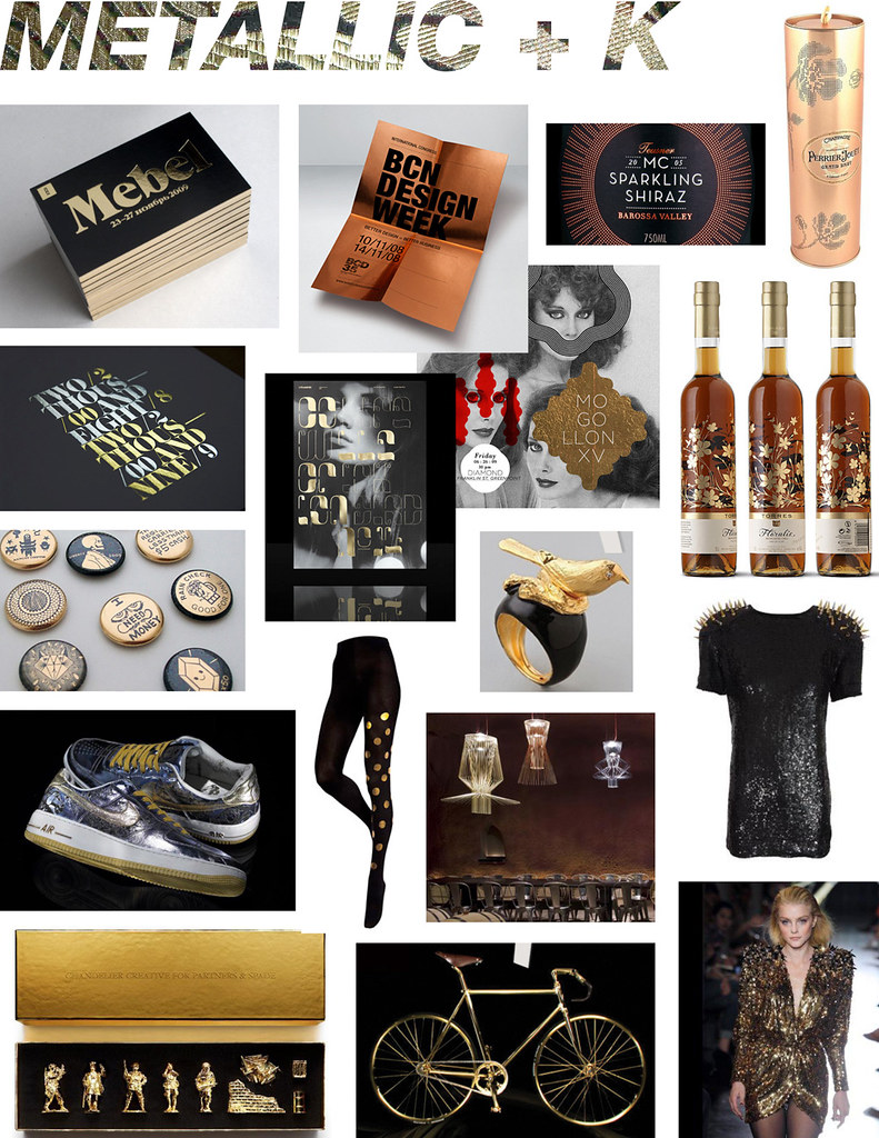
Mood Board//Metallic + Black


As far as I'm concerned, metallic and black is the most opulent, seductive color combination out there. I'm specifically drawn to black and gold, but really any lustrous hue will do. And much to my pleasure, I'm seeing a lot more of this trend in design—specifically in fashion, packaging, and decor. I (like many people, I'm sure) am bored with the recession and anticipate a return to extravagance and luxury—even if only on the surface!
Share/Bookmark

Wednesday, April 7, 2010

Mood Board // Playing Cards


This mood board highlighting the trend of playing cards is way overdue. I recall this trend emerging last year (check out this May 2009 post on Pattern Pulp). Since then, no doubt spurred by Alice in Wonderland fever, the trend has become extremely prevalent. There are countless ways to play off the idea of reflection and suits inherent in playing card graphics, which has resulted in a lot of fun, thoughtful posters and promotional pieces. It also adds a carnival-like element of playfulness when incorporated into editorial fashion spreads. In addition, Playing cards serves as a unique medium to display art, such as seen with Shelter’s House of Cards campaign, where 52 designers and artists, including Vivienne Westwood, Damien Hirst, and M/M Paris, each designed a card to be auctioned off for charity.
Share/Bookmark

Friday, February 12, 2010

Austin Color Vignettes


I recently visited Austin for the first time and was amazed, among other things, by all of the incredible vintage stores on South Congress. I was particularly fond of Uncommon Objects, a store dedicated to "antiques, oddities, and curious goods". Not only did they have an impressive stock, but they organized this unique inventory into color vignettes. Which I suppose is the most practical system considering their disparate array of goods! I love the idea of seemingly arbitrary organization based on color; check out this Design Observer article on the subject of color arrangement specific to book organization.
Share/Bookmark

Monday, January 25, 2010

Mood Board // Anaglyphs


As previously revealed in my post on Op Art, I don't always need an insightful reason to like something. In some instances, just being unique and eye-catching works for me. Which is how I feel about the Anaglyph trend I've been witnessing of late. Feel free to read about the science of it all here. My earliest encounter with this technique used in design probably holds true for many graphic designers my age: Stefan Sagmeister's "Made You Look" monograph cover (published in 2001, and which upon reading we find was a technique he previously used for an album cover). But what was once just a cool gimmick seems to have manifested itself into a trendy technique employed in the design of everything from editorial and environmental graphics to fashion and furniture. I adore how Marios Schwab went anaglyph crazy with the prints in his Fall 2009 collection. If you are feeling inspired you can visit the website of talented interactive designer Paul Neave and doodle your own anaglyph-- it looks cool even if you don't have the filtering red and blue glasses!
Share/Bookmark

Monday, November 30, 2009

Mood Board // Wood


Wood is a fantastic material to spur a trend because it can be manipulated in countless creative ways. Wood grain integrated into illustrative graphics provides interesting texture, and can become instantly playful and whimsical when injected with an unexpected color. I first noticed this trend a few seasons ago when I saw these Established & Sons dressers for sale at Moss and then in Paul Smith stores shortly thereafter. Wood, although inexpensive, is also a choice material to create rich window displays (examples here and here) and loses any kind of "crunchy" connotation when integrated into luxury items such as with this iphone case and theseBalenciaga glasses.
Share/Bookmark

Sunday, November 1, 2009

Flickr Set // Window Displays


I love walking around the city to view window displays for creative inspiration and to stay on top of emerging trends. I have recently begun photographing those that I find exceptionally unique and stunning and have decided to start a Flickr set that I can reference and share. It my intention to update the set on a regular basis so feel free to check in from time to time!
Share/Bookmark

Monday, October 12, 2009

Mood Board // Origami


My guess is that this trend in part grew from the popularity of the DIY movement and the desire to experiment with physical material, as opposed to constantly producing in a virtual world. This idea of folding, whether ultimately rendered in space or on screen, has refreshing results when applied to graphic design, and as always, the trend seems to be most prevalent in poster design. It is also a creative, inexpensive way to spice up an environment, as I saw in a number of window displays over the past few months, including Chanel and Kate's Paperie. And when applied to fabric in fashion, in many instances, has an almost intergalactic feel, emulating a sharp exoskeleton of sorts.
Share/Bookmark

Monday, September 28, 2009

Mood Board // Op Art


I would say I first became enamored with Op Art in design while working on my senior branding project in college (see my final logo incorporated into an absurdly ambitious spinning business card here!). And I should probably have a thoughtful way of expressing my fondness for this emerging trend of illusion in design, but when it comes down to it, I just thinks it's completely rad. There are a lot of impressive examples of op art in graphics, specifically posters and album art, but Alexander McQueen has blown my mind with his Fall 2009 and Resort 2010 fashion collections.
Share/Bookmark

Thursday, September 3, 2009

Mood Board // Dots


Flat, colorful dots! You know those circular stickers people use at garage sales and flee markets? I feel like they are being arbitrarily stuck everywhere! Without a doubt, the resulting effect is fun and optimistic: a refreshing sentiment in this worrisome economic climate. I am particularly drawn to the "dot-as-head" manifestation; it reminds me of this collage I saw last year at the MoMA.
Share/Bookmark

Monday, August 24, 2009

Mood Board // 3D Type


This week's trend is 3D Type. As a type aficionado, I am completely amazed and tickled by the creativity behind fabricating dimensional typography, with materials ranging from cardboard and fabric to raw meat and fur. And although I prefer the handmade variety, I also appreciate the use of software to create virtual dimensional type. Even the new highly-controversial SyFy logotype is rendered in 3D!
Share/Bookmark

Sunday, August 16, 2009

Mood Board // Surrealism


I am really amused by the emerging surrealist trend, defined by elements of "surprise, unexpected juxtapositions and non sequitur". There are countless trippy surrealist gestures in fashion advertisements this season (check out some impressive Balenciaga ones here), but I'd have to say my favorite surrealist nod is the Dark Disco in the Park poster I've seen posted all over the city.
Share/Bookmark

Friday, August 14, 2009

Barneys Windows


I am currently reading the highly-entertaining book "Confessions of a Window Dresser" by Simon Doonan, the flamboyant, cheeky creative director of Barney's since 1986. Inspired, I headed uptown on a pilgrimage of sorts to see the current window display. I was not disappointed. You can see more images of his notable, and sometimes notorious, displays here and here.
Share/Bookmark

Monday, August 10, 2009

Mood Board // Birthday


So at first I just saw balloons everywhere, but recently I've noticed a trend of other birthday elements as well, including cake, letter banners, and other festive decoration. Though right now this trend is most prevalent in photo shoots, I'm sure it will find its way into other media soon enough. I'd like to think I spread some of the birthday love myself by carrying my 10th Anniversary issue of WAD magazine through a number of city parks and subways last week.
Share/Bookmark

Monday, August 3, 2009

Mood Board // Triangles


Triangles are everywhere! This trend has manifested itself into branding, fashion, art, product design, etc. etc. Triangles seem to be the prevalent shape to emerge from the overarching geometric trend (which I attribute to conceptual design programs such as Yale; Gluekit does it well).
Share/Bookmark

Sunday, August 2, 2009

Custom Woven Labels


I have been apprenticing at a millinery studio in the East Village for quite some time now, and recently have been attempting to make my own cocktail pieces for myself and friends. Which is why this birthday gift from my friend Elen is so incredibly rad and thoughtful. She had these personalized labels made that read "Made Especially For You By Christine" that I can sew into my creations. I love the tomato-red/brown color combo and the victorian silhouette enveloped in a wispy border. The design completely compliments the retro aesthetic of my work. See the variety of designs available here.
Share/Bookmark