
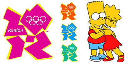
So London's 2012 Olympic logo (designed by Wolff Olins) has been unveiled and wow people pissed. Apparently it cost £400,000 (which my pound-to-dollar converter tells me is $796,879), took a year to develop, and was inspired by graffiti art. Though intended to be "vibrant" and "youthful", the general consensus is that it is completely overpriced and an artistic flop. There is even a petition to change it! I don't hate it, but I'm far from impressed. It seems that the placement of "London" and the Olympic rings was a complete afterthought. However, the best comment I've yet to read is from The Daily Telegraph:
"What it reminds me of, and you will have to forgive me if you consider this lewd, is Lisa Simpson performing an unnatural act upon her brother Bart."
I will NEVER be able to see that logo again without thinking the same.
6 comments:
It looks like a japanamation subtitle or something.
it looks like the crap I doodled in my notebooks when I was a kid trying to copy graffiti letters.
so now the commercials are potentially being tagged for the potential of epileptic seizure... i love it i feel like i should be wearing a headband and listening to wham... yeah london! seriously though, what?
***
UPDATE
Readers of the BBC News website have been sending in their alternate logos...
http://news.bbc.co.uk/2/hi/in_pictures/6719747.stm
http://news.bbc.co.uk/2/hi/in_pictures/6722205.stm
Nice links Kris, most of them are so awesomely bad! My favorite:
http://newsimg.bbc.co.uk/media/images/43007000/jpg/_43007281_graham_coe416.jpg
Its really awesome try more , xe währungsumrechner
Post a Comment