I went to the International Contemporary Furniture Fair
(ICFF) over the weekend and came across some great design. As an environmental and print graphic designer, I actually found some of the booth designs and promo material more exciting than the furniture itself, but there is no denying that it was all inspiring!
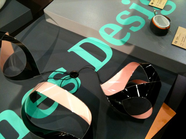
Love the wrapping-surface vinyl typography throughout this display (plus the aqua-colored type goes well with the glossy pale pink and black lighting fixtures!)
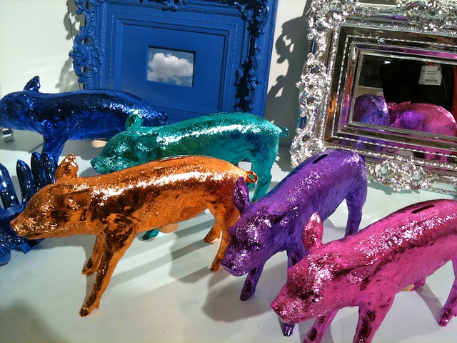
oink oink.
AREAWARE
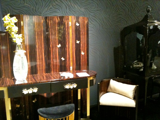
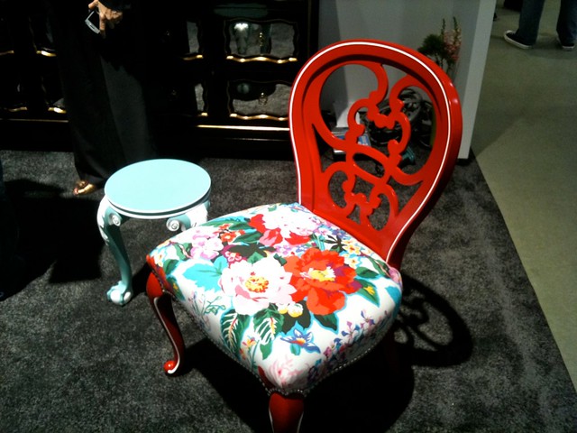
When I get rich and can afford fancy furniture, I am getting everything from the Portuguese company
Boca Do Lobo. I even adore the black-on-black zebra-print wallpaper!
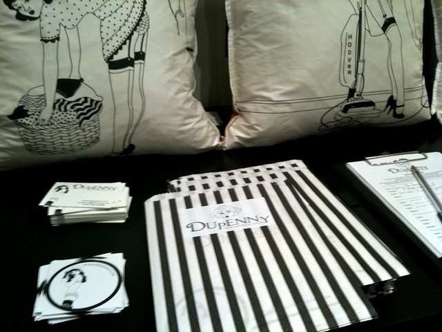
This was a really cute way to distribute promotional material at
Dupenny.
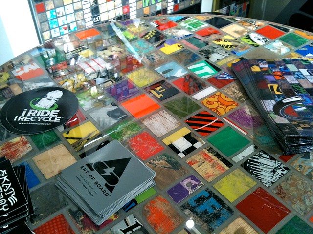
I've gotta be honest: I'm generally not into the whole eco-friendly design thing, but I was super impressed by these designs from
Art of the Board which recycle broken skateboards to create furniture, environmental displays, etc.

Metropolis Magazine had my favorite booth design; they used cyan, magenta, and yellow strings to create the booth's structure and displayed old issue covers along the top.
Love Dorthy Draper! So of course I fell for this furniture by
Kindel.
See more photos
here!

ICFF 2011

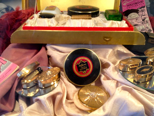 The museum was originally purchased by the legendary Max Factor so there are lots of vintage cosmetics.
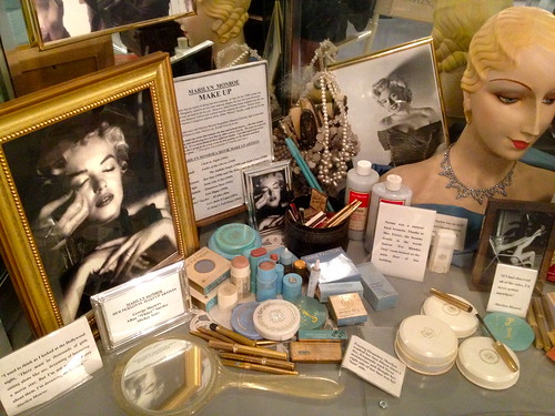 There was an exhibit on Marilyn Monroe when I was there, and this, apparently, was her makeup.
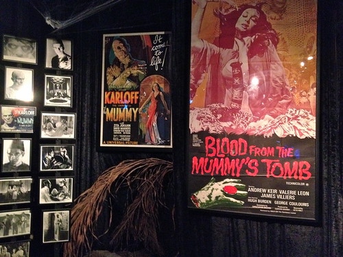 The basement is dedicated to “all things creepy and scary.”
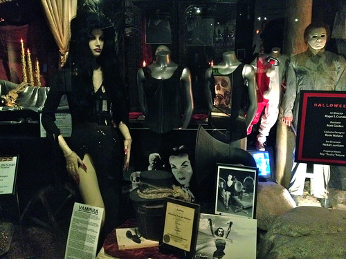 Vampira!