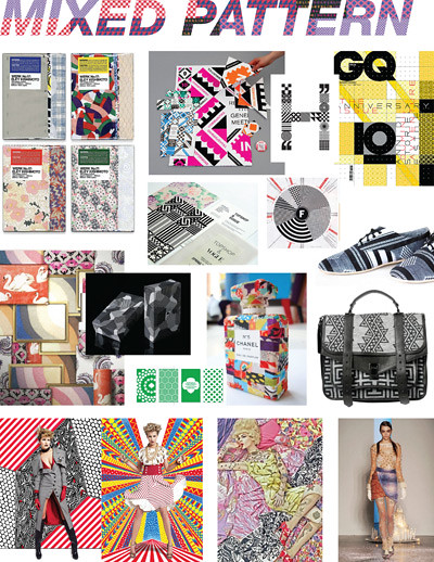
As those familiar with my design sensibilities can attest, my mantra has always been "More is More". I am a self proclaimed maximalist, and in fact even did a school project on the topic many years ago (for the record, completely absurd, but quite fun at the time)! I confess all this to introduce my next trend-inspired mood board: Mixed Patterns. More is More is More! I am sure this trend offends many "discerning" folk, but I argue that when done well, the results can be quite elegant and attractive. This fall, without a doubt, I plan to rip off this mixed-polka-dot-and-leopard-print look from Dolce & Gabbana. In other disciplines, Illustrator Nikki Farquharson integrates this technique brilliantly with fashion photography. And my favorite interior designer of all time, Dorothy Draper, proved mixing patterns when decorating can make an otherwise typical, drab, space feel rich and opulent!

No comments:
Post a Comment